Everything you need to know about Website Wireframes
Website wireframes are an important part of web design and development, but they have more applications across a range of services. This includes any CRO A/B testing or UX recommendations, as well as any page redesigns or landing pages.
So, what are website wireframes and why are they an important part of the design process?
Website wireframes
A website wireframe is a visual guide that represents the underlying structure of a website. It is a simple black and white layout of the webpage, outlining the elements, features, conversion areas and navigation on the specific page.
Here is a basic example of a website wireframe.
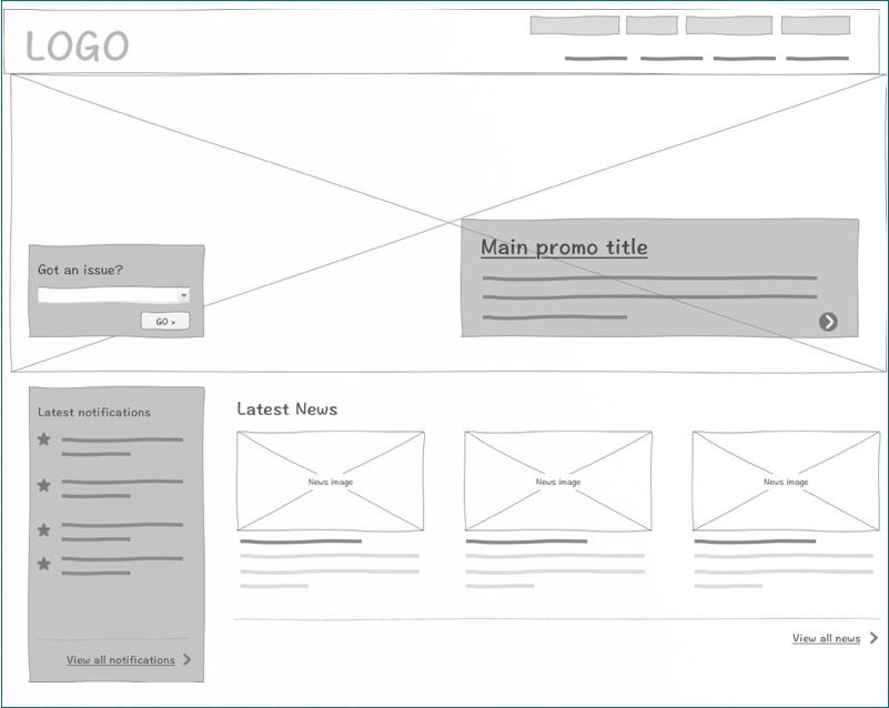
Website wireframe example (Source)
A website wireframe is developed after the website architecture has been confirmed and before the creative design phase and styles are applied.
What is the purpose of website wireframes?
As part of the overall digital experience preplanning stage, a website wireframe helps clients visualise where elements and content should be placed on a website to accomplish a particular objective. They ensure that each page of the website has a purpose and achieves the goals defined for the website.
In the absence of fonts and other decorative elements, designers can focus on the key aspects of user experience that encourage conversion and increase customer loyalty. Viewing the bare structure of a website forces designers to objectively analyse the conversion paths, naming of links, navigation placements, feature placement and overall usability.
What are the benefits of wireframing websites?
- They allow design changes to be easily made.
- They help make content development more design friendly.
- They focus on usability and user experience.
- They allow all key stakeholders to be able to visualise the structure clearly regardless of technical knowledge.
- They ensure the design process is iterative.
- They help to refine the navigation and internal architecture.
Types of webpage wireframes
There are three levels of wireframe fidelity that can be considered when designing a website layout. The fidelity is a measure of the level of detail that is added to the wireframe, thus the greater the fidelity, the closer the wireframes are to the real website design. To determine what level of fidelity to use for the wireframe you should ask a couple of questions, including:
- Who will be seeing these wireframes? (web designers, stakeholders, clients, etc?)
- What kind of feedback are you aiming for? (Feedback on the functionality and user experience, or on the design and layout?)
1. Low fidelity wireframes
The most basic type of wireframe typically only outlines the elements on the website so that designers can see where everything fits together. They are useful and inexpensive because they can be changed easily and quickly if required.
Low fidelity wireframe (Source)
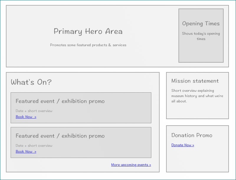
2. Mid fidelity wireframes
A mid fidelity wireframe sits in-between a rough outline and a demo website, but still resemble the sketchiness of a low fidelity wireframe. This level of design includes a higher level of functionality, information architecture and includes placeholders for content, such as images and text.
Medium fidelity wireframe (Source)
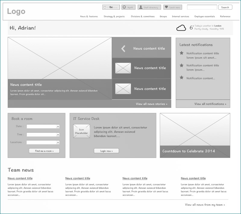
3. High fidelity wireframes
A high-fidelity wireframe fills in all the details that were not expressed in the low and mid fidelity wireframes. They are a mock-up of the final design, including colours, branding, copy and samples of images. These wireframes give the client a visual impression of what the final site will look like.
High fidelity wireframe (Source)
Best practice webs design layouts
There are 3 common design layouts for websites that have been tried and tested to capture the attention of users and keep them engaged. Just as every website is different, the design strategies should also be different, meaning that these frameworks need to be altered and adapted to suit your website.
Gaining an understanding of how different website layouts can influence user behaviour is a central principle of creating an effective user experience on a website.
1. Gutenberg diagram
This layout design describes the pattern that a user takes when looking at evenly distributed, homogenous information. This diagram suggests that users are subject to a “reading gravity” that falls directly from the top left of the page to the bottom right of the page. Although the reader is viewing the top left corner and the bottom right corner, this theory suggests that they don’t view everything in between and rather that they follow the page in a diagonal line.
The general pattern of the Gutenberg diagram suggests that the strong and weak focal areas fall outside the reading gravity path and receive minimal attention unless emphasised visually in some way.
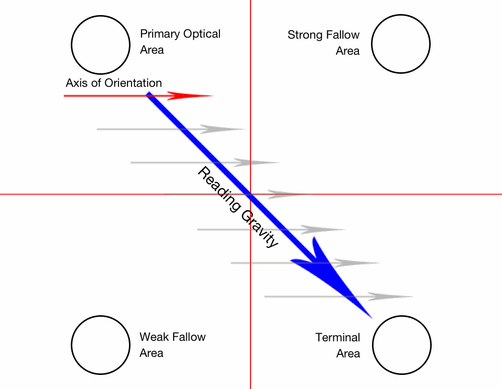
Gutenberg Diagram (Source)
Why use it?
This theory helps designers plan where elements of the website should be placed. For example, the theory suggests that the bottom left corner is a weak focal area. By knowing this we can avoid putting essential information there and avoid putting calls to action there as users are less likely to see it.
2. Z-Pattern
This layout design suggests that you place your website content in the shape of a “Z.” Begin with important information along the top of the “Z” and the user’s eye will naturally follow the path to a call-to-action button at the end.
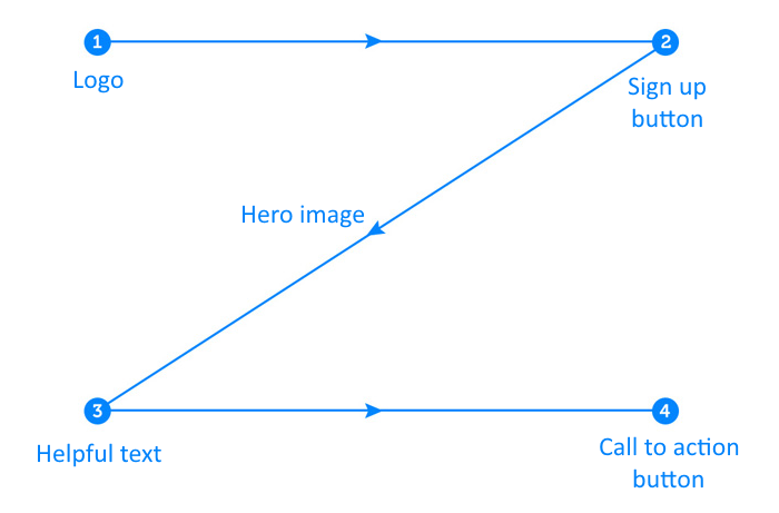
Z-Pattern layout (Source)
Why use it?
This layout isn’t ideal for all websites, but it is a good starting point for many. The Z-pattern layout addresses the four principles of effective design: branding, hierarchy, structure, and a call to action.
3. F-Pattern
The F-pattern layout indicates that web users read the screen in an “F” pattern with the top left corner and left side receiving the most attention. The right-hand side of the page only gains a few glances and indicates that all of the most important elements of the site should be placed along the top and on the left-hand side.
Here’s a heatmap showing the F-pattern in action.
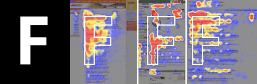
F-pattern (Source)
Why use it?
This layout works because it allows users to scan the content naturally. Most websites that incorporate this layout rely heavily on “calls to action” in the navigation or sidebar to drive revenue or encourage user engagement.
If you are looking for more information on how UX works or advice on how to structure (or re-structure) your website, talk to our digital marketing experts and we can help you determine your goals and improve conversion rates.