Responsive vs Adaptive vs Dedicated Mobile Sites: Which Should You Use?
The Cross-Platform Design Debacle
There is some debate as to how you should go about designing and building a new website; especially with regards to mobile-first design. The responsive vs. adaptive vs. dedicated mobile site controversy continues, with designers and developers at arms about which technique is best.
Each technique serves its own purpose and has a functional reason for being used, however it’s worth taking the time to find which is best for your site. With Google in the process of rolling out their mobile-first index, now is the time to start thinking about making sure your site is up-to-date and as mobile friendly as possible.
Drawing on our expertise as a digital marketing agency, we will walk you through each mobile design technique, their pros and cons, and finally, help you to decide which technique will be best suited to your website and end users.
What is Responsive Web Design?
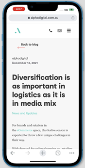
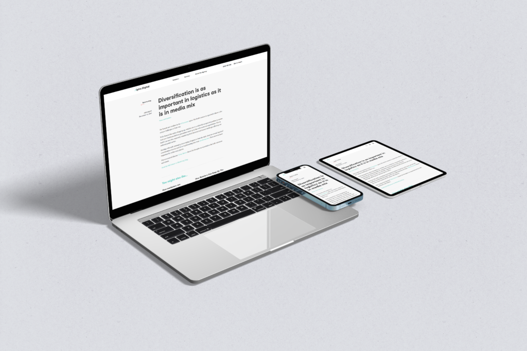
Responsive design is a technique used to create ‘fluid’ pages that, in theory, will work across any device or screen size. Responsive design uses media queries to adjust the layout based on the screen or window size. The Alpha Digital website is responsive – if you’re on a desktop, try it now; resize this browser window and see how the layout changes – specifically the title and hero image on this page – depending on how big the window is.
Advantages of Responsive Web Design
The main benefit to responsive web design vs. adaptive design or standalone mobile sites is that it is easy to update the pages and adjust without any extra work involved – i.e., updating multiple versions of the page or even a whole different website. The site is built once and uses media queries to adjust the layout to fit every device size fluidly.
Disadvantages of Responsive Web Design
There are, however, also downsides that come with responsive web design. Because a responsive website is coded as a single entity (as opposed to having a desktop website and then a separate, dedicated “m-dot” mobile website), all the page resources and code must be downloaded for each user’s visit, regardless of the screen size or device that they are visiting from. Often, mobile versions of responsively-designed websites omit displaying certain elements to make pages or sections more user-friendly, but these elements will still need to be “invisibly” loaded.
This means that somewhat counterintuitively, responsive design can make pages slower to load; something that has been proven as a ranking factor in Google’s search results.
What is Adaptive Mobile Design?
Adaptive design (AKA dynamic design) shares similarities with responsive design in that a website is built to display correctly across devices. The main difference being that adaptively designed pages have fixed layout sizes for different screen sizes, as opposed to being ‘fluid’, like responsive design. Generally speaking, when building a site using adaptive design, you would build for three main devices:
- Desktop
- Mobile
- Tablet
Advantages of Adaptive Design for Mobile
The difference with adaptive vs. responsive design is that each version of the page is built as a separate entity. The main advantage of adaptive design, besides adapting to display correctly across different devices, is that only the version of the site relative to the device in use needs to be loaded. For example, if a user visits an adaptively designed site on a mobile device, only the mobile version of the page will be loaded. This can provide significant advantages in boosting scores for user experience, especially in Google eyes.
Of course, a big advantage of loading only the required resources on a page is the boost in page load times – fewer resources to load means a quicker load time. There are, again, downsides to adaptive design, though. The boosts in page load speeds come at a price. Literally.
Disadvantages of Adaptive Design for Mobile
As previously mentioned, when using adaptive web design techniques, each version of a page is built separately from one another, meaning each version needs to be updated separately from one another. More often than not, more than the three ‘main’ versions of a page are created (commonly, 6 versions are built) to ensure the page displays correctly across a plethora of screen sizes – since mobile, desktop and tablet devices come in a range of sizes, resolutions and aspect ratios, all of which need to be considered when building a new website. This makes a designer’s job harder and more time consuming, meaning it makes the cost for development / updates etc. much higher.
Another thing to consider with adaptive design is, due to the page only loading the resources it needs, if the screen is resized during a session it will not re-adapt to fit, it will hold its current form.
Adaptive web design gives you much more control over the layout of the site / page(s) on each device size, however with this extra control comes extra work – which is totally worth it for some but can be cumbersome and expensive for others.
What is a dedicated mobile site? (“m. site”)
Dedicated mobile sites were the original idea to solve mobile browsing frustrations. In the early days of mobile internet usage, a desktop site would be loaded in a mobile browser. This of course came with a number of user experience issues – one of the main being that most desktop monitors are in a landscape orientation, and as such websites were built in a landscape aspect ratio as standard; mobile devices are mostly in portrait orientation, meaning desktop-designed websites had to be squashed and distorted to fit. This usually results in everything becoming very small and difficult to see and navigate.
As such, the mobile site was born.
Dedicated mobile sites / standalone mobile sites / m. sites / m(dot) sites, whatever your preferred terminology is, are a completely separate entity to your main site, usually built on a subdomain of the top-level domain (TLD). In most cases this would be an “m.domain-name.com” configuration, although there are countless variations. They are built specifically for mobile devices and are often much more ‘lightweight’ versions of the desktop site, removing any unneeded styling, scripts, and large images, both to improve the way the site is displayed and shorten page load times.
Advantages of Using Dedicated Mobile Sites
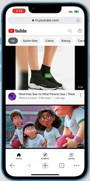
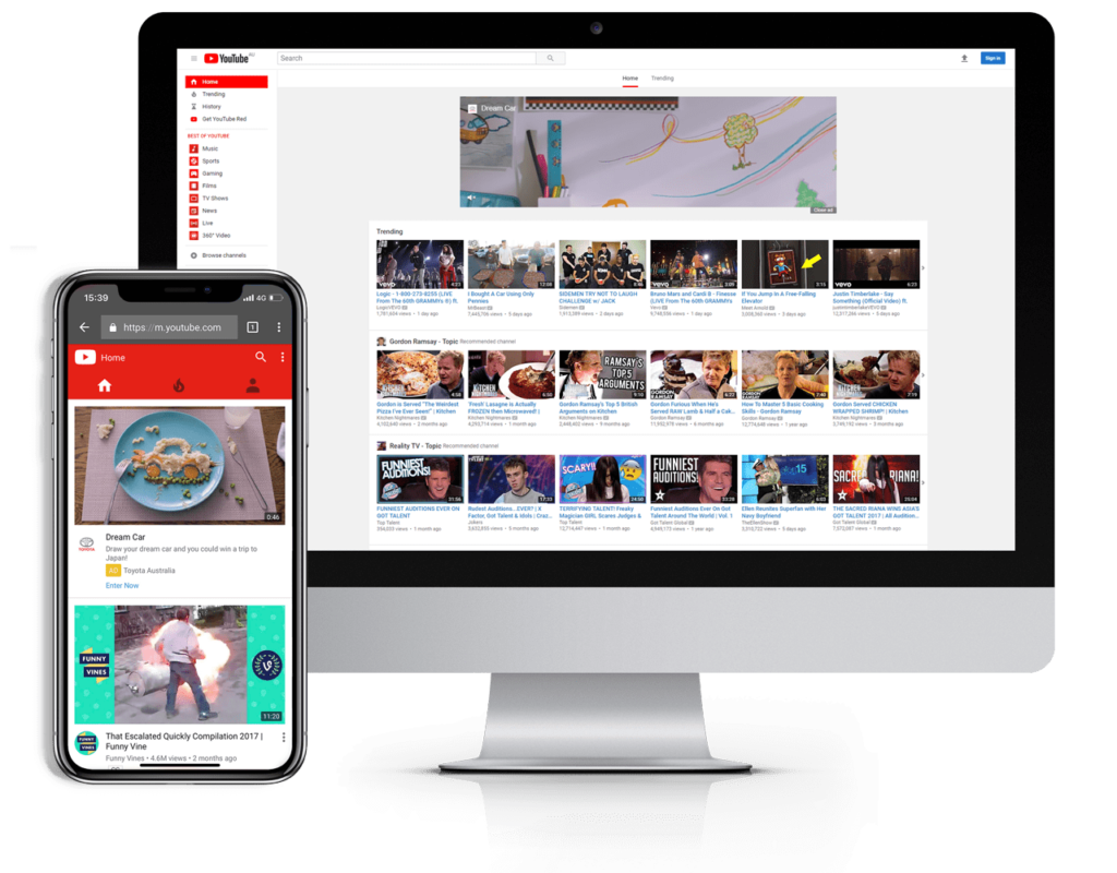
Although on the decline, dedicated mobile sites are certainly not dead yet, with giants like Facebook and YouTube using “m. sites” to harness extra functionality from their sites on mobiles, and to create an immersive and user-friendly experience. The Facebook and YouTube mobile sites actually look somewhat similar to their mobile apps (which is essentially what they are – web-apps for mobile), for which a separate, mobile-only site is perfect. This would not be easily possible using responsive design.
Disadvantages of Dedicated Mobile Sites
As with adaptive design, standalone mobile sites are built separately from the main website (in fact, adaptive and mobile-only sites are often used in conjunction with each other), meaning any maintenance would often need to be done in addition to the primary site, increasing the costs of development and upkeep. For this reason, mobile sites are declining in popularity, and it is generally believed that they likely won’t make a return in the near future.
Responsive Design vs. Adaptive Design vs. Dedicated Mobile Sites
| User Experience | Ease of Maintenance | Functionality | Cost of Development | |
|---|---|---|---|---|
| Responsive | **** | ***** | **** | **** |
| Adaptive | **** | ** | **** | *** |
| Dedicated | *** | ** | *** | *** |
Based on the table above, responsive design is the way to go when building your mobile-first site. With an all-round good user experience, easy upkeep and maintenance of the site, good functionality and user experience and, generally speaking, the lowest development costs, it’s a no-brainer.
This is a generalisation, however, and to really make the right decision with which design technique will work best for you, you need to take a look at who is using your site, and from what devices. You also need to consider what people access your site for, and what functionality it needs to have.
YouTube: Responsive, Adaptive & Mobile-Only Website(s) Example
YouTube is an interesting example in that it technically uses all three methods of design – responsive design ensures content looks good at any screen size on larger devices (laptops, desktops), while the adaptive and mobile-only site(s) work almost in harmony to deliver the best results on mobile / tablet, with the adaptive nature of the build deciding which size / style of site to serve to users based on what device, screen size, aspect ratio etc. they are accessing the site from. The design ensures each user gets an optimal experience no matter how they access the site.
It’s a complicated setup, and one that we don’t need to delve any further into here.
Alpha Digital: Responsive Website Example
The Alpha Digital site also uses responsive design, however we do not have a mobile-only site as we do not need the added functionality. Building one would only cause headaches for our developers, as well as leave us with much lighter wallets! The responsive design resizes the site all the way down to mobile screen sizes and the layout is adjusted for optimal usability across all devices.
So, Should You Use Responsive, Adaptive, or a Dedicated Mobile Site?
This isn’t a question that this article will answer definitively. Although we can provide some helpful tips. As previously mentioned, each method comes with its advantages and disadvantages and although there is arguably no right or wrong answer, there may be a more advantageous method for your specific situation.
When to Use Responsive Web Design
Responsive web design is ideal for smaller companies who need their existing site updated, or for those building a brand-new site for a new business. It is generally (but certainly not exclusively) best suited to service-based industries, due to these websites being comprised mainly of text and images (as opposed to lots of products and interactive widgets and tools that are found on eCommerce sites), and are easily manipulated for good all-round, cross-device user experience.
Responsive design also suits companies with a smaller budget who need a great looking site for a reasonable price. Future updates and upkeep tend to come at a smaller price with responsive websites as well, which is great news for those operating on tight margins.
When to Use Adaptive Mobile Design
Adaptive design is best suited to those who need more control over how the website is displayed to users across different devices. Think about how your customers use your website, and how it might differ on a mobile device compared with a desktop device. For example, a restaurant booking service site might be a hub for reviews, recommendations, and general browsing of options on a desktop device, where users are likely accessing from home. On a mobile, users may have totally different requirements – they are out and about, perhaps on the way to the restaurant, and need to find directions, or parking, or need the phone number to call the restaurant if they are running late.
Using adaptive design, you can completely re-organise the website to become tailored to the user’s needs and provide a more granular control over the elements on the page – even adding entirely new elements, or remove space-hogging, less-used elements.
When to Use a Dedicated Mobile Site
Dedicated mobile sites are best used to give an ‘app-like’ feel to a website that demands a lot of functionality. They are a totally separate entity and should be treated like one, while ensuring it stays integral to your ‘main’ website. Functionality may stay largely the same, but user experience and usability will likely be somewhat different on a mobile device compared with a desktop version of the site – it should be a better experience, optimised and streamlined for use on mobile.
The mobile-only site is a dying practice but is still being used. If your website can, or does, double as a mobile app, it might be worth considering creating a mobile-only site that mirrors the look and feel of the app, much like YouTube and Facebook have.
Conclusion
In hindsight, it could be argued that there is a right answer as to “should I use responsive, adaptive or a dedicated mobile site?”; it could also be argued that there is no right answer. It really comes down to the nature of your site, how your users access your site, and how they use it from each device. Once you have this information, you can begin to tailor you approach in their best interest to give them an incredible experience no matter where they access from.
It is also worth considering how each decision you make for your website affects its page load speed, as this is incredibly important for your site’s SEO.